Fruit Menu Revamp (2019)
Typography | Layout Design
|
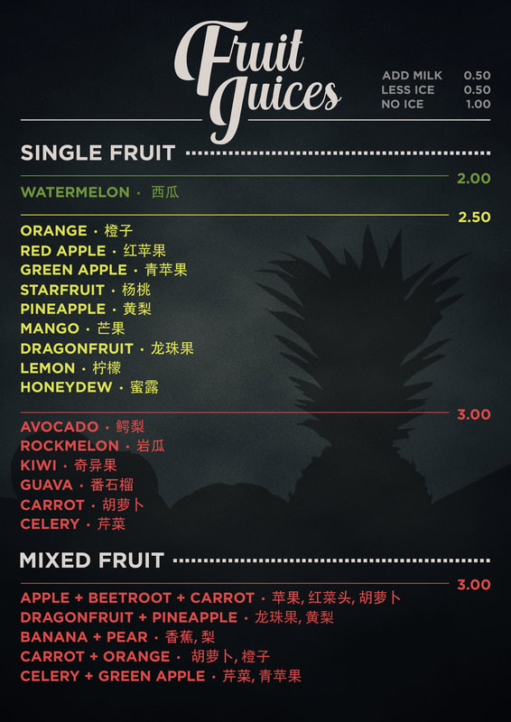
Translations in Mandarin were added into the menu due to the high numbers of Chinese workers in the vicinity. The prices were color-coded for better reference for both customers and cashiers. The options to add milk or remove ice were placed at the top, allowing customers to be aware of their beverage options. |
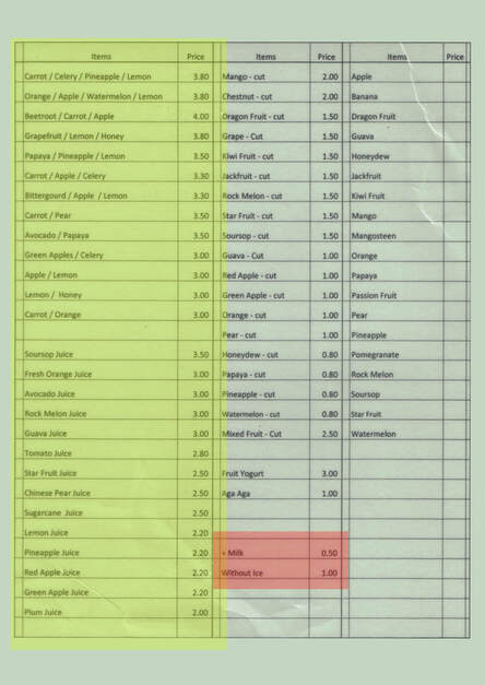
The client wished to have a menu solely for its juices, thus only those in the yellow box was required. Certain juices that were unpopular were also removed in order to make the updated menu less saturated. The options to add milk or have no ice was put into the menu list alongside the items, giving limited visibility. Highlighted in red, there was a need to shift them to a different hierarchy in the updated menu. |


